Replacing React code with CSS :has selector
Looking into what the new CSS :has selector is and how it can be used to improve our React code. Includes practical and beautiful examples.
Community-supported translations : 日本語
Nadia Makarevich

Since the dawn of time… okay, since the beginning of CSS at least, we have been taught that CSS is cascading. It's literally in the name, they are Cascading Style Sheets. Via CSS, an element can target an element inside of it, then an element inside, etc. But never, ever in the reverse order. An element can not apply styles to a parent element by any means other than via JavaScript.
Until now.
The CSS :has selector is now supported by all major browsers, and with it, we actually can now target parent elements. And more! The world, indeed, is turned upside down. If you, like me, started your dev career in those blessed times when we were doing round corners on elements via transparent GIFs, the possibilities today will blow your mind.
So, other than being a cool new toy, what practical use does it actually have in the React world? Let's take a look at three very exciting ones.
What is the :has selector?
If you remember, in "standard" CSS, we can do this:
.content .card {background: #f0f0f0;}.content img {margin: 1rem 0;}
This changes the background of a .card element inside a .content element to light grey and adds margins to images inside. So that it's visually separated from the text.
We can also select the next sibling with + or ~ combinators. For example, if this image is right after the .card element, we might want to add an additional margin to it so that it's even more visually separated.
// images that immediately follow a card element// will have bigger margins than other images.content .card + img {margin: 2rem 0;}
Check out the code example here.
However, until recently, we couldn't select elements in the "opposite" direction. If I wanted to change the background of a .card element that is immediately followed by an image, for example, that would've been impossible without JavaScript. Or to style the .card differently if it had an image inside - also nope.
The new CSS selector :has fixes that.
I want to have pink borders on my .card elements with images inside and grey borders on all the others? Easy peasy!
// all the cards will have grey top borders.card {border-top: 10px solid #f6f7f6;}// cards with images inside will have pink borders.card:has(img) {border-top: 10px solid #fee6ec;}
The :has selector works with other selectors too. I also want to add blue borders on cards that are followed by an image? Sure thing! We can check that condition with the + combinator.
// if a card has an image as a next element - give it a blue border.card:has(+ img) {border-top: 10px solid #c4f4ff;}
We can even go crazy and code something like "apply a green background to a .card element that does not have an h3 tag inside, has an img tag inside, has another .card element immediately after, and an img tag anywhere after that, but only if it's followed by a card with more than one image".
// have fun reading that ;).card:not(:has(h3)):has(img):has(+ .card):has(~ img):has(~ .card):has(> img:nth-child(1)) {background-color: #c3dcd0;}
Check out the implemented example below.
However, when it comes to our React apps, is this really something we want to do? Styles like that are heavily leaking through component boundaries, the same as child selectors. Didn't we spend the last decade or so inventing creative ways to prevent exactly that? BEM, SASS, CSS-in-JS, CSS modules… We do everything in our power to scope the styling only to the elements it's assigned to.
Why would we suddenly revert everything and do the opposite of all the best practices? Other than the fact that we tend to do that every few years in React anyway, of course 😅
The answer: so that we can remove a bunch of complicated React code! Sometimes, the best React code is no React code. And despite the last crazy selector (seriously, don't do that to your colleagues), replacing React with CSS can simplify the logic and even sometimes improve performance a bit.
Let's take a look at some practical examples of that.
:has selector and focus state on elements
Imagine we're implementing a task board. The board will have a bunch of cards, each card has two buttons: "open" and "delete". Clicking on the "open" button will open the full content of the card in a modal. Clicking on "delete" deletes the card.
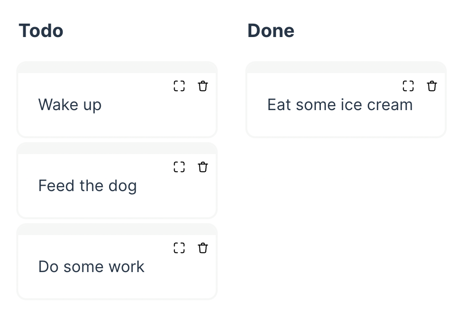
The card's code here is trivial:
<div className="card">Some text here<div className="buttons"><button><Open /></button><button><Delete /></button></div></div>
We want it to be fully keyboard accessible: tabbing to those buttons should work. On top of that, I want the cards to highlight which button is tabbed into to improve accessibility for keyboard users. When a user tabs to any of those buttons, I want the card to "pop" slightly and the other cards in the column to grey out. Plus, I want to change the border color of the active card to highlight the current active interaction. Red for the "delete" button, and green for the "open" button.
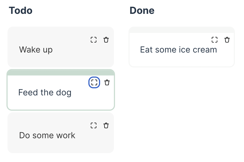
If we were to implement this functionality with React, we'd have to add a focus event listener, detect which button is currently active, maintain the state so that we can change the classNames on the card itself, and somehow share that state with the parent so that other cards can be changed as well. We would probably have to introduce Context or some other state management solution for it. Before you know it, we'd have to implement a full-blown focus manager that re-renders every card on every tab. No wonder we don't see this fancy interactivity in the real world, and the best we can hope for is consistent outlines on buttons.
With the :has selector, however, it's more or less trivial to implement what I just described.
First step. Assign some data- attributes to the buttons so that we can select them without relying on className:
// add data-action attributes to the buttons<button data-action="open"><Open /></button><button data-action="delete"><Delete /></button>
Second step. Find the card with the focused "delete" button inside and change its CSS:
// make the card "pop" and change its border colors// if the "delete" button inside the card is focused.card:has([data-action='delete']:focus-visible) {border-top: 10px solid #f7bccb;box-shadow: 0 0 0 2px #f7bccb;transform: scale(1.02);}
Third step. Find the card with the focused "open" button inside and change its CSS:
// make the card "pop" and change its border colors// if the "open" button inside the card is focused.card:has([data-action='open']:focus-visible) {transform: scale(1.02);border-top: 10px solid #c3dccf;box-shadow: 0 0 0 2px #c3dccf;}
Forth step. This is the hardest one: we need to find all the cards before and after the card with focused open or delete buttons and then grey them out. The magic:
// all cards after the card with focused "open" button.card:has([data-action='open']:focus-visible) ~ .card,// all cards after the card with focused "delete" button.card:has([data-action='delete']:focus-visible) ~ .card,// all cards before the card with focused "open" button.card:has(~ .card [data-action='open']:focus-visible),// all cards before the card with focused "delete" button.card:has(~ .card [data-action='delete']:focus-visible) {filter: greyscale();background-color: #f6f7f6;}
The end result: the most beautiful keyboard navigation in all the boards ever with zero JavaScript and zero React re-renders! A live example is below to play around with.
:has selector and categories of stuff
Another use case for the :has selector that I find fascinating in its simplicity is color-coding stuff based on some data.
For example, let's implement a table with products that are sold in our shop. These products fit into specific categories: let's say we're selling office supplies, clothes, and horses online. The table will have a few columns and, in its simplest form, will look something like this:
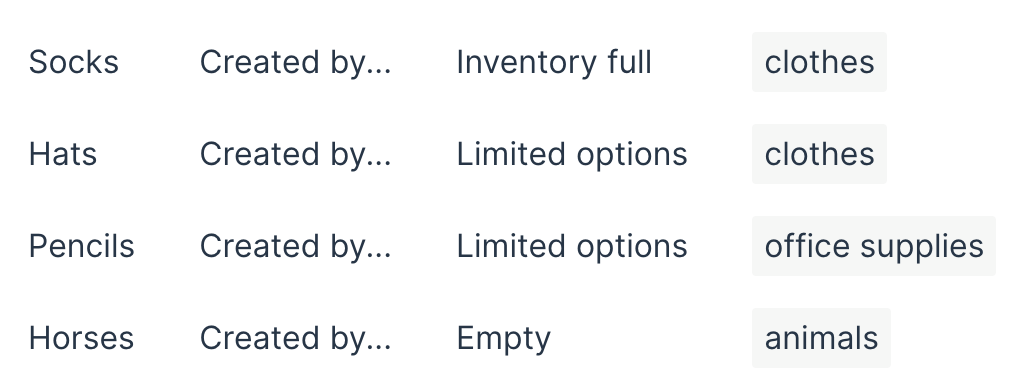
and be coded like this:
...<tr><td>Socks</td><td>Created by...</td><td>Inventory full</td><td><span className="category">clothes</span></td></tr>...
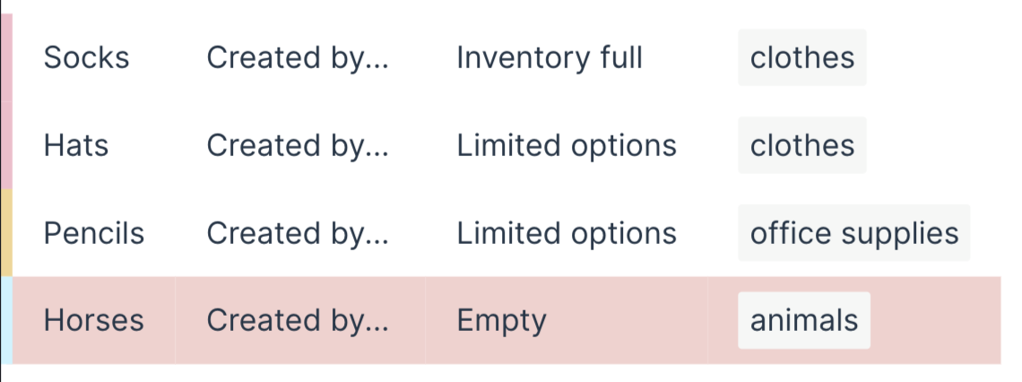
Now, I want to subtly highlight which row belongs to which category by drawing a border on the left with the category's color. And when an inventory is empty, I want to highlight that row with a red background so that people pay attention to it. This is how I want it to look:
In React, we'd have to pass information about the category and the inventory through props to at least the row tag, maybe even the first cell. And create class names or even internal components for every variation. Totally unnecessary complication in this case.
Instead, we can just do this.
Step 1. Add data- attributes with the information to the cells that already have that information.
<tr><td>Socks</td><td>Created by...</td><!-- add data-inventory attribute here --><td data-inventory="full">Inventory full</td><td><!-- add data-category attribute here --><span className="category" data-category="clothes">clothes</span></td></tr>
Step 2. Color-code everything we need with the help of the :has attribute.
Add different colored borders to the first cell of the row if the row has an element with the data-category attribute.
.table tr:has([data-category='clothes']) td:first-child {border-left: 6px solid #f7bccb;}.table tr:has([data-category='office']) td:first-child {border-left: 6px solid #f4d592;}.table tr:has([data-category='animals']) td:first-child {border-left: 6px solid #c4f4ff;}
Add the red background if the row has an element with the data-inventory attribute with the empty value.
.table tr:has([data-inventory='empty']) {background: #f6d0ce;}
And voila - the table is beautifully color-coded. The coolest part here is that if those attributes come from a dynamic state and tend to be updated frequently, the entire row won't have to re-render to update the colors! Only the cell with the data-attribute. Again, a tiny potential performance improvement in addition to the cleaner code.
Check out the interactive example below.
:has selector and form elements
And finally, a very powerful use case for the:has selector that I really like is styling elements based on the form elements' state.
For example, in a form where inputs can be disabled, we can also visually "disable" the input's label and description.
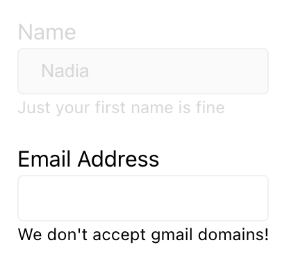
The code for this form will look something like this:
<form className="form"><fieldset>...<label htmlFor="form-name">Name</label><input type="text" name="name" id="form-name" disabled value="Nadia" /><div className="description">Just your first name is fine</div>...</fieldset><fieldset>...<label htmlFor="form-email">Email Address</label><input type="email" name="email" id="form-email" required /><div className="description">We don't accept gmail domains!</div>...</fieldset></form>
Then in CSS, we'd target a fieldset that has an input with the :disabled state, and style label and .description elements.
fieldset:has(input:disabled) label,fieldset:has(input:disabled) .description {color: #d6d6d6;}
Focus, of course, will also work. If we want to add a line at the left when the input is focused,
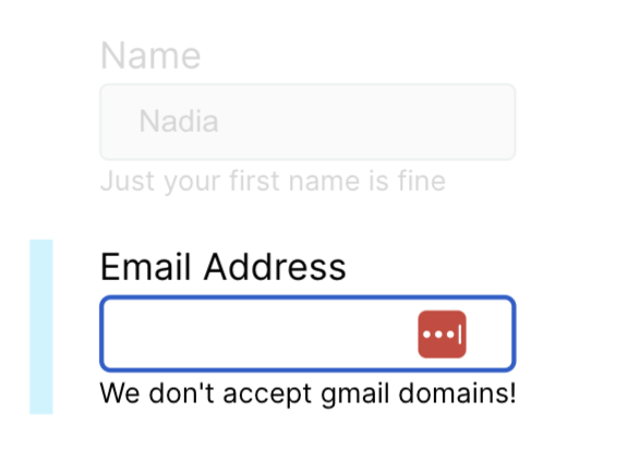
we can just do this:
fieldset:has(input:focus-visible) {border-left: 10px solid #c4f4ff;}
Or, if we're implementing a list with checkboxes, we can easily highlight the "checked" row without even storing the checkbox's state and creating an .active class, as we usually do for situations like this.
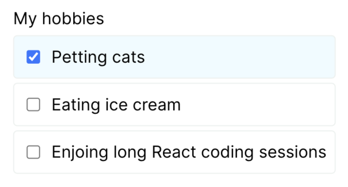
All we need is a CSS selector:
.list-with-checkboxes li:has(input:checked) {background: rgba(196, 244, 255, 0.3);}
Here's the live preview, check it out:
How cool is all of this, right? What's your favorite :has-related trick? Share in the comments!
Of course, there are many more good opportunities to simplify our React code with clever selectors. These are just a few examples that I particularly liked. If you want to learn more about the :has selector and play around with more cool examples, here's the list of articles I particularly liked that have plenty of those:
-
Meet :has, A Native CSS Parent Selector (And More) — Smashing Magazine
-
Level Up Your CSS Skills With The :has() Selector — Smashing Magazine
-
Style a parent element based on its number of children using CSS :has()
By looking at how CSS has progressed in recent years, maybe in five-ish years, we won't need React at all. 🤯 What an interesting day that would be!